Schreinerei Schilling.
A website for a craftsmanship business that lets the work speak rather than the copy. Generous gallery, clear navigation, a direct path to contact.
schreinerei-schilling.ch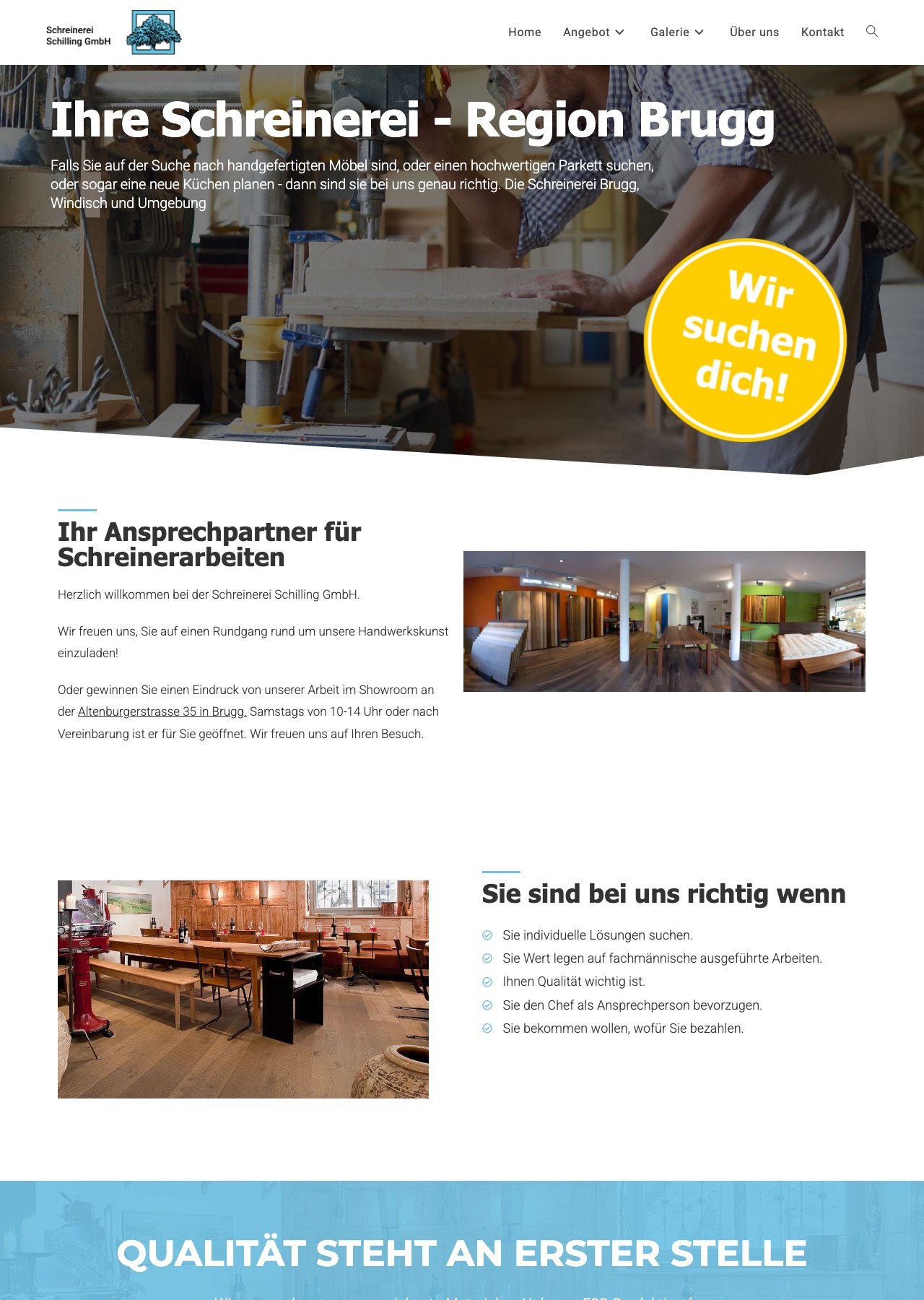
Does this starting point sound familiar?
Reply within one working day
The starting point
Craft businesses live on their handwriting, and you see that in the work that has been done, not in marketing copy. The previous web presence was text-heavy, poorly illustrated and tangled in navigation. Anyone looking for references or a way to get in touch had to click through several levels.
What I did
The navigation was cut back to the essentials: work, services, about, contact. Every level is one click away, and every section ends with a clear next step, get in touch, another area, a sample piece. The gallery became the core element: large images with short captions, grouped by craft, so prospects find the relevant work directly.
The web design relies on calm typography, plenty of whitespace and restrained colour, so the work itself gets the stage.
The outcome
The site shows what the workshop can do without disappearing into copy. The gallery sits ahead of the contact path: completed work is visible before anyone gets in touch.
Something like this for your business?
Reply within one working day